Mattress Refresh & Differentiation
How do customers make a confident and informed decision when purchasing a mattress online when they are unable feel the material or give it a test-sleep?
Project Problem and Goals
With sales falling behind our quarterly projections, the Director of eCommerce and the Chief Marketing Officer challenged me and a small team to research, redesign, and develop the entire product discovery flow for our mattress collections. We identified four major friction points:
The architecture combined mattress models into three families on our home page, categories, & navigation, hiding that we have five mattress models
The design pattern did not articulate why customers would benefit from the unique offerings across the mattress collection
Repetitive images and videos across individual models and families
There wasn't a straightforward story about why customers should upgrade their mattresses
With a site wide redesign project going live in six months, we divided this rapid redesign exercise into four phases to quickly solve these problems.
Phase 1 - Formative Research
Gain a better understanding of customer needs through competitive and SWOT analyses, stakeholder interviews, site audit, design team critiques, and unmoderated goal-completion usability tests.
Phase 2 - Refresh
Enhance a customer’s understanding as to what makes Purple’s unique technology better than the competition.
Designs were restricted to existing patterns and components.
Phase 3 - Differentiate
Design new features that clarify the website's mattress assortment architecture, differentiating the messaging around benefits, and encouraging model upgrades.
Purple’s 5th mattress was launched during this phase, making diversification all the more important.
Phase 4 - Reskin
Using the findings from the Mattress Refresh & Differentiation project, integrate the new stylings from Purple’s larger UI redesign effort into all mattress related screens.
Phase 1 - Formative Research
Methods: Heuristics evaluation, competitive & SWOT analyses, stakeholder interviews, rapid prototyping, moderated usability test with participatory design
Ideation
I started the project with a SWOT analysis with 4 of our competitors to better understand the space and identify any design patterns we could use. I presented these findings and a Purple purchase-flow audit to the VP of eComm and the Director of Consumer Insights. The three of us brainstormed and devised five creative directions for me to explore and test.
Prototyping and Testing
After sketching rough drafts of what the category and product pages could look like, I created six high-fidelity prototypes for live interviews on usertesting.com. We conducted 16 usability sessions, each one lasting 90 minutes. For the first half, the user would perform a goal completion test on one of the variations. After they finished, we then asked them to compare it to a second prototype to identify any friction points or moments of confusion. The second half of the session was a participatory design exercise. We asked the users to solve any problems they ran into during the test verbally. I would design their recommendations live on a Zoom screen share until we all agreed on a solution.
We would go on to test this new, collaborative design with our next participant.
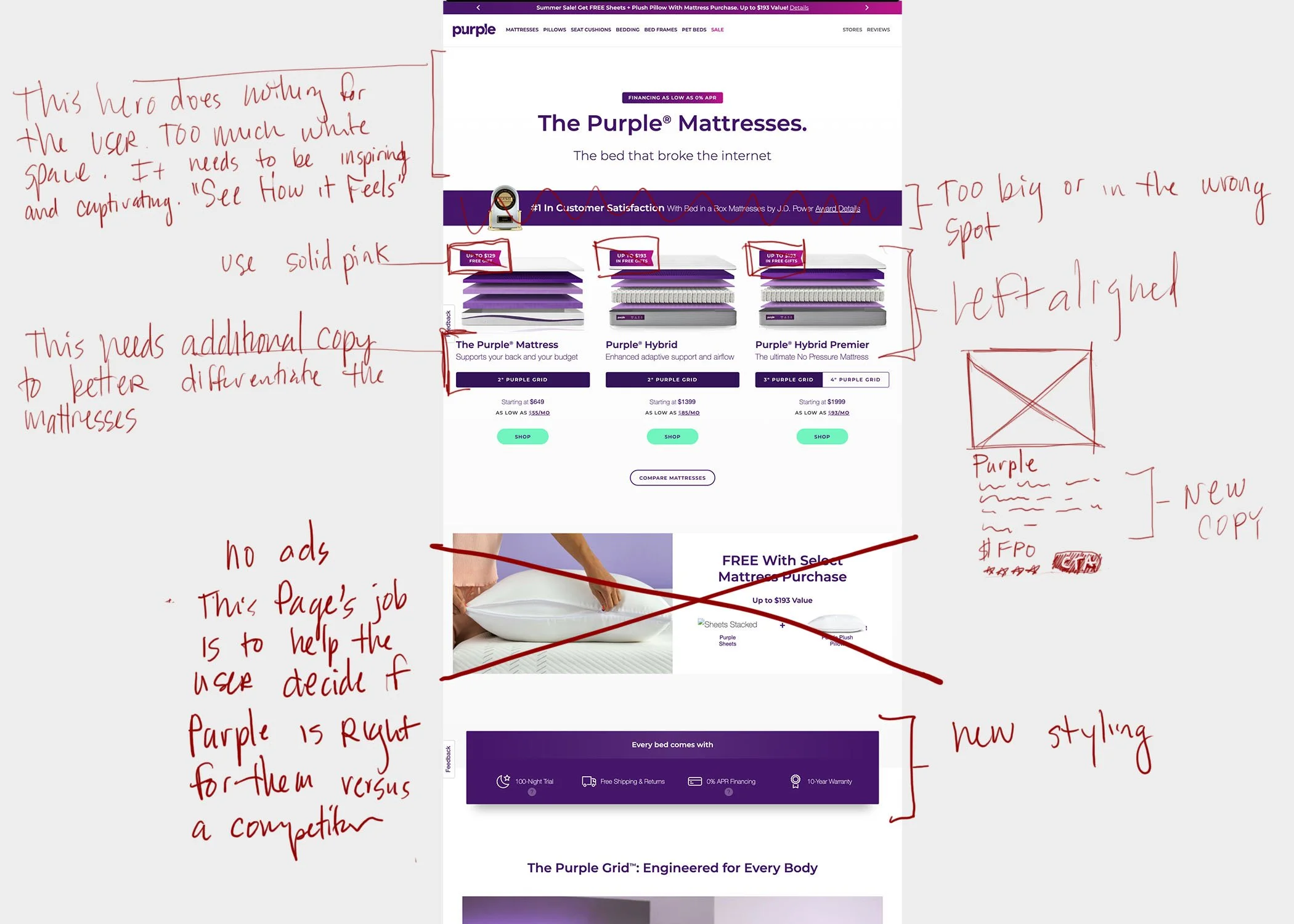
Findings and Solutions
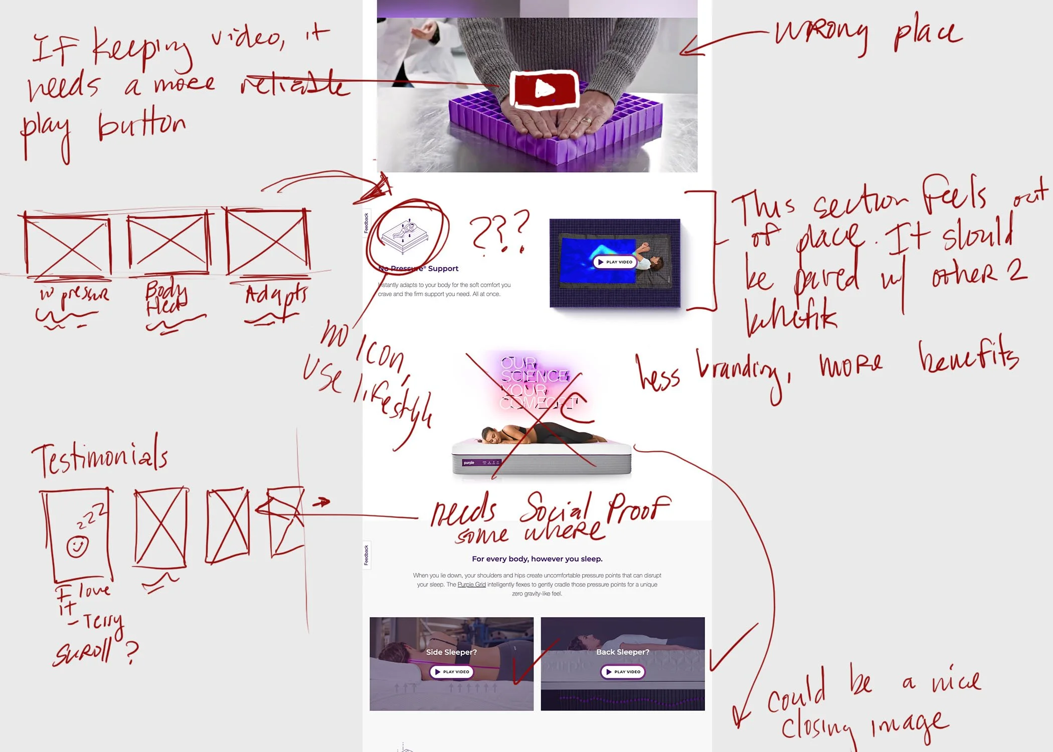
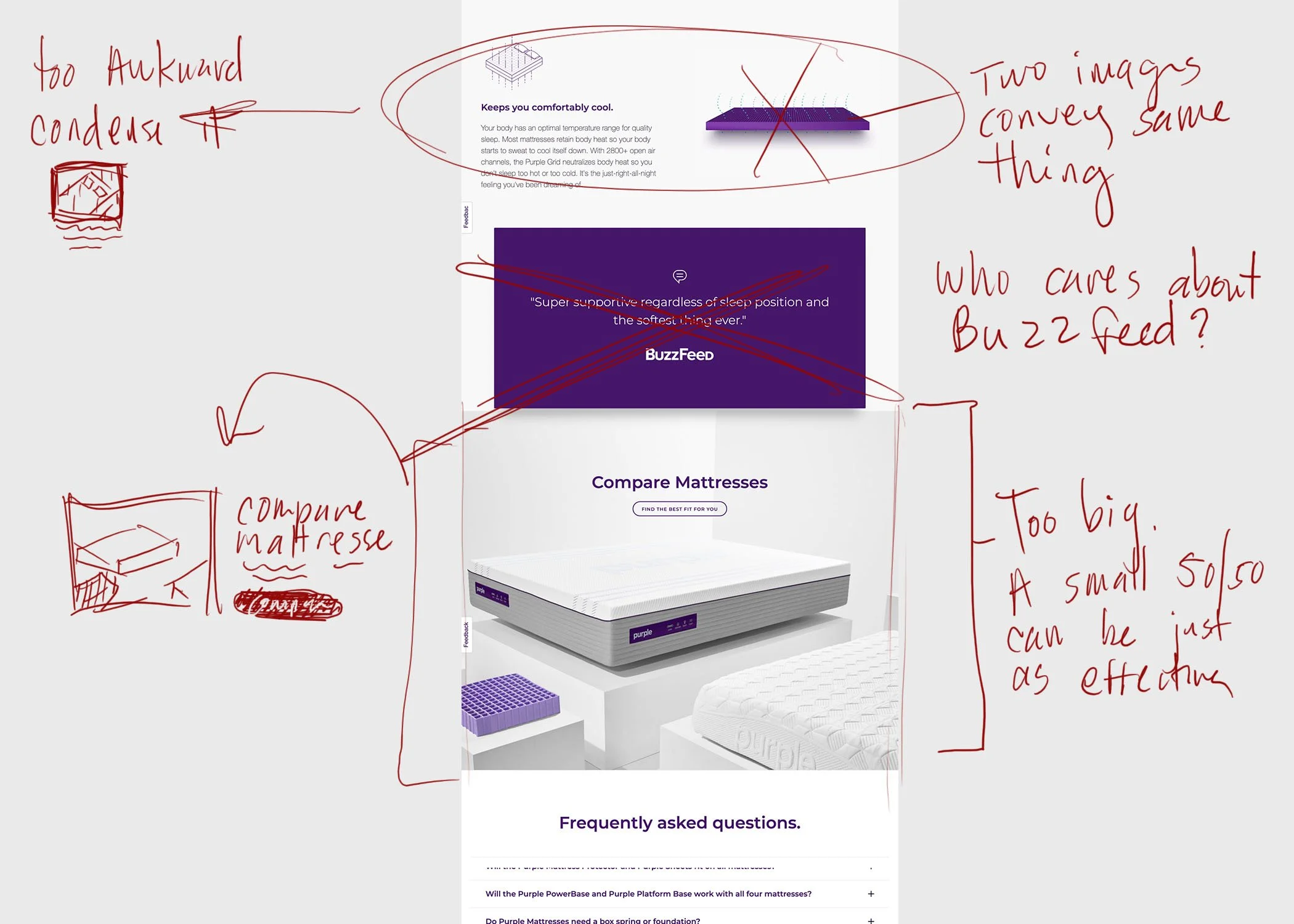
Customers have a difficult time finding answers to the questions they have about our product. The existing copy uses too many marketing terms and sounds too gimmicky. The site's tone needs to be conversational and speak more clearly.
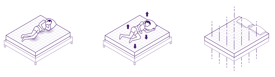
Customers are unable to "see how it feels". The site should include more photography or videos with humans interacting with the mattress's grid technology instead of trying to explain it through text.
Customers lack consumer confidence. The redesign needs to show testimonials, reviews, and partnerships.
Phase 2 - Refresh
Methods: High fidelity wireframes, unmoderated usability tests, card sorting, and ranking tests.
Designing
The overall idea for this phase was to tell a great story and clean up UI inconsistencies. I took the most impactful features from testing my six prototypes and refined them into a single, production-ready comp. I ran this design through usertesting and edited any minor friction points. Below are select examples of the final updates:
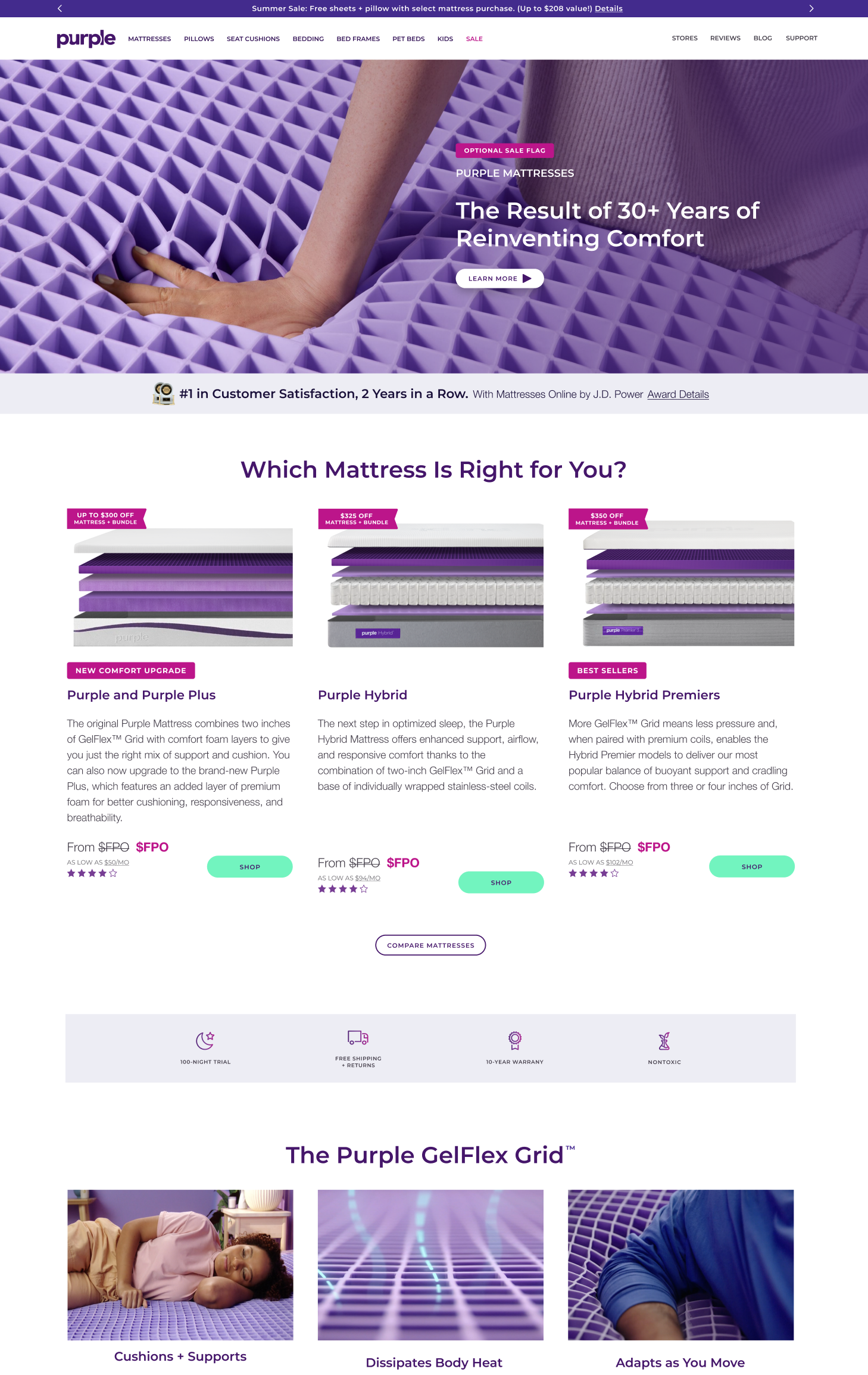
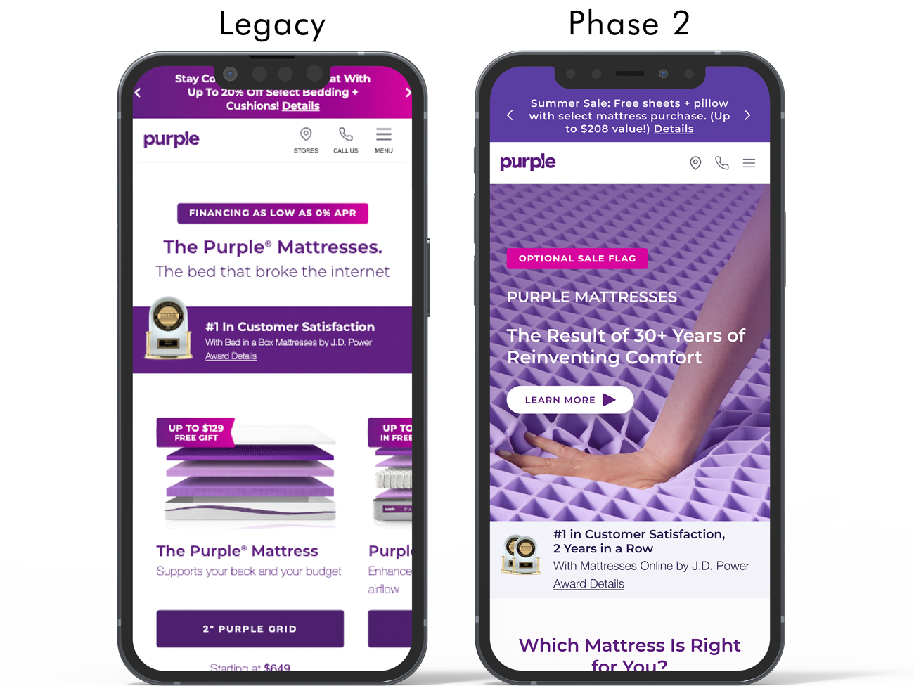
Category Page’s 1st Impression
On the left, we can see that the legacy site was lackluster. It was necessary to tell a more visually compelling story while providing the user options to learn more through a captivating video.
Additionally, I wanted to clean up the page's color story so that it feels modern and clean.
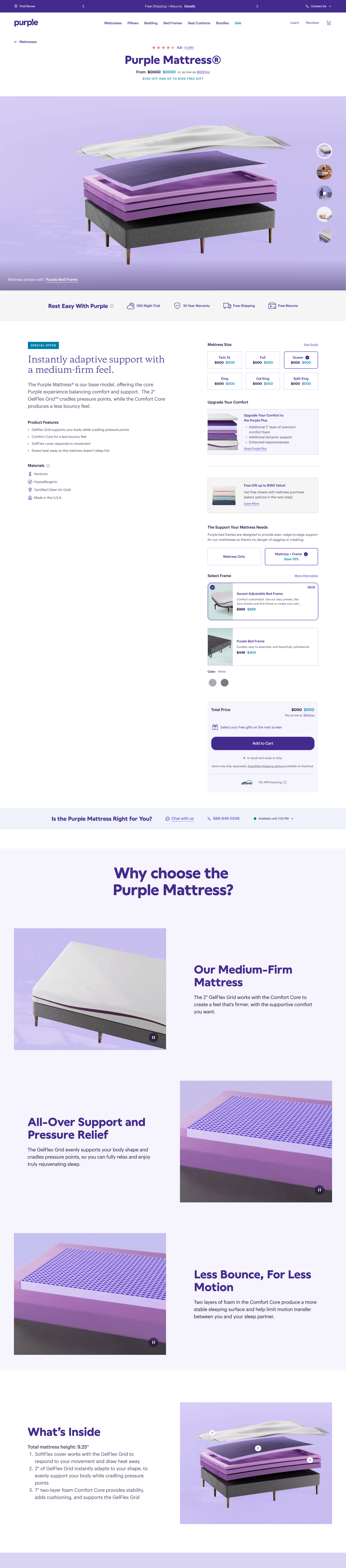
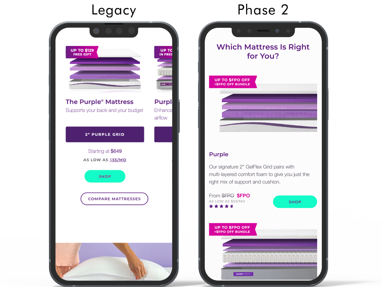
Product Selection
When designing, I prefer not to hide critical information behind bells and whistles. My first decision was to make this page mobile-friendly by breaking the carousel into product cards.
This edit gave us more real estate to include a description for clarity and star ratings for social proof.
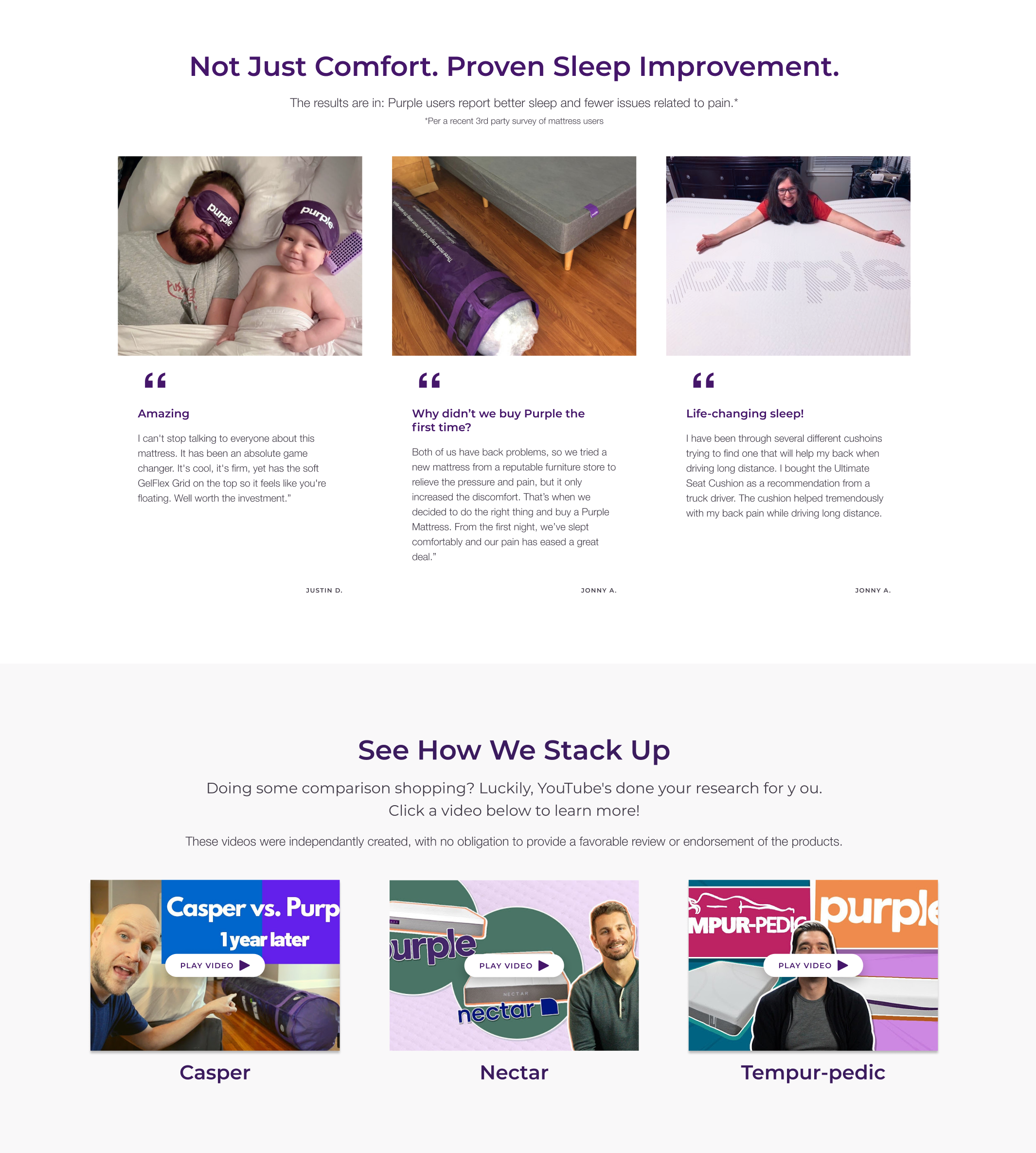
User Generated Content
One essential element was missing from the Category and Product pages - real people. Our interviews suggested that users' sentiment towards Purple was significantly more positive when presented with customer testimonials and 3rd party reviews.
They noted that if they could not try out the product in person, they felt more comfortable with their decision with the help of digital recommendations.
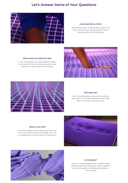
Visual FAQ
Steve Krug put it best when he said “don’t make me think”. From my interviews, I identified five questions that were consistently asked:
Is the bed soft or firm?
What does the grid feel like?
What is the grid?
Will I get hot?
Is it durable?
The explanations were available to users on the existing page but were not plainly stated or hidden. I solved this problem by creating a visual FAQ section that gave customers the answers to questions they would be asking themselves.
Phase 3 - Differentiation
Methods: High fidelity wireframes, unmoderated usability tests, Qualtrics rank order and slider tests.
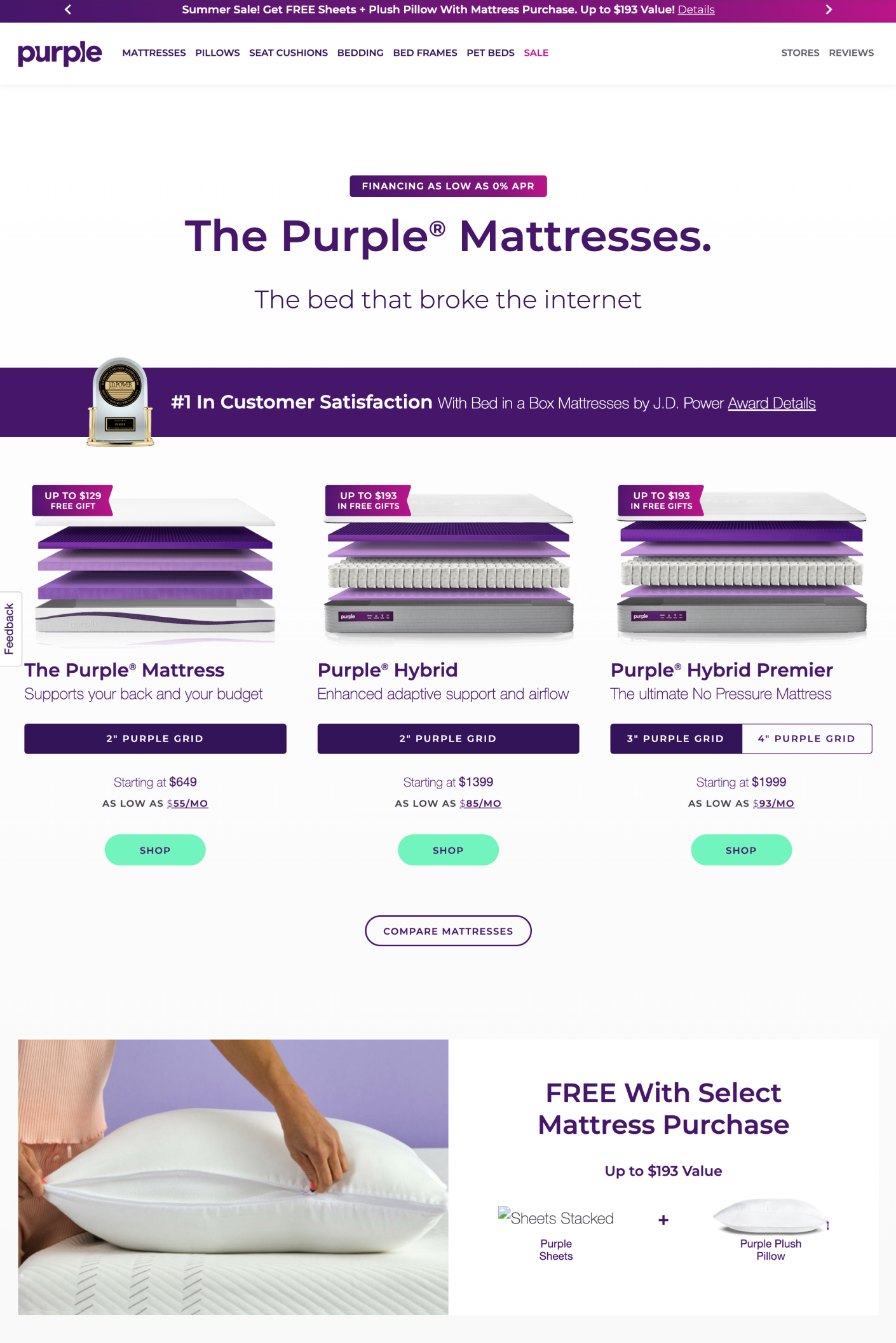
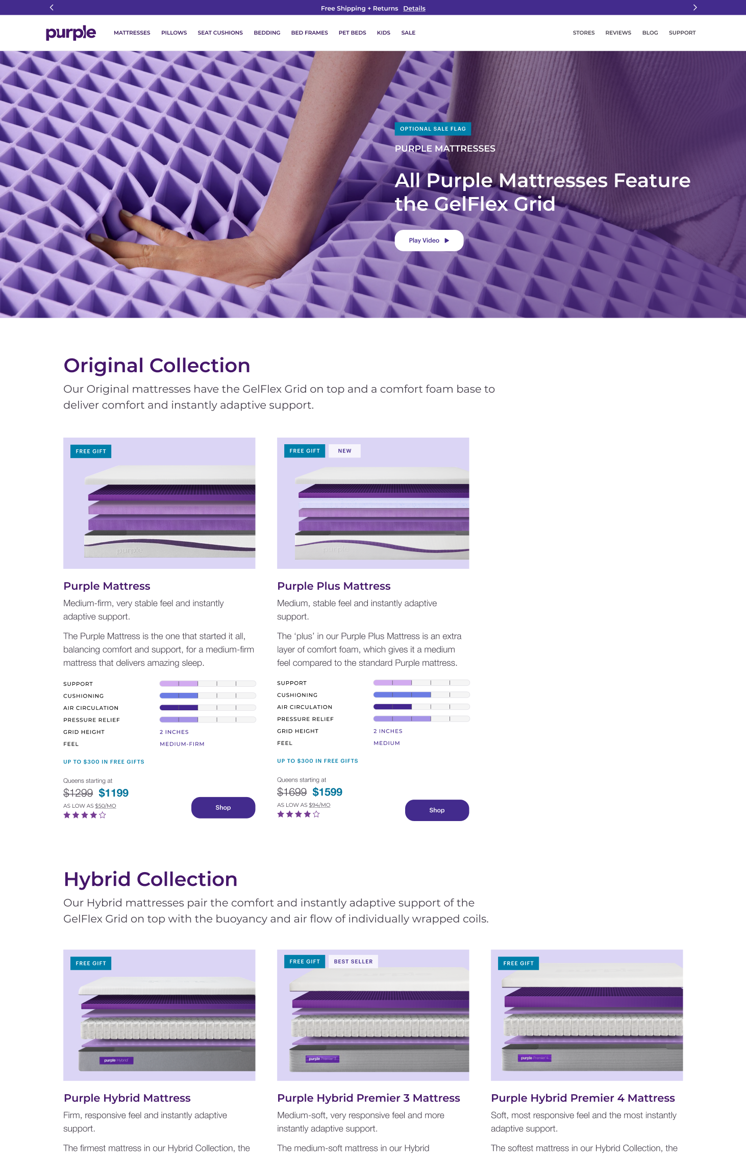
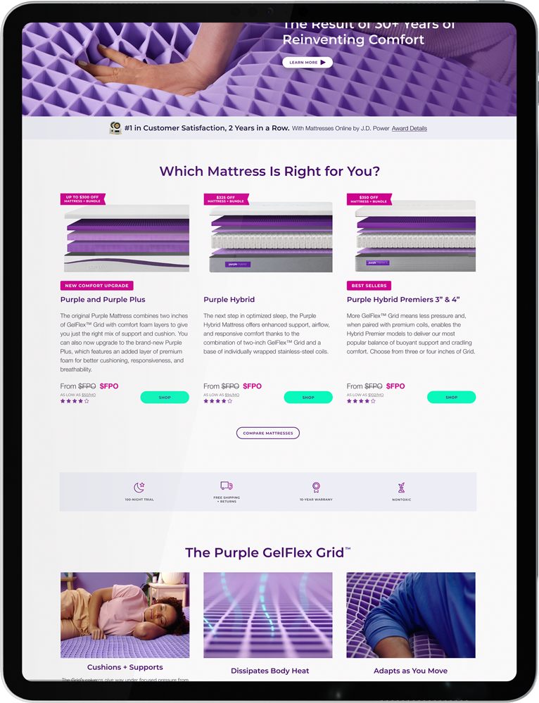
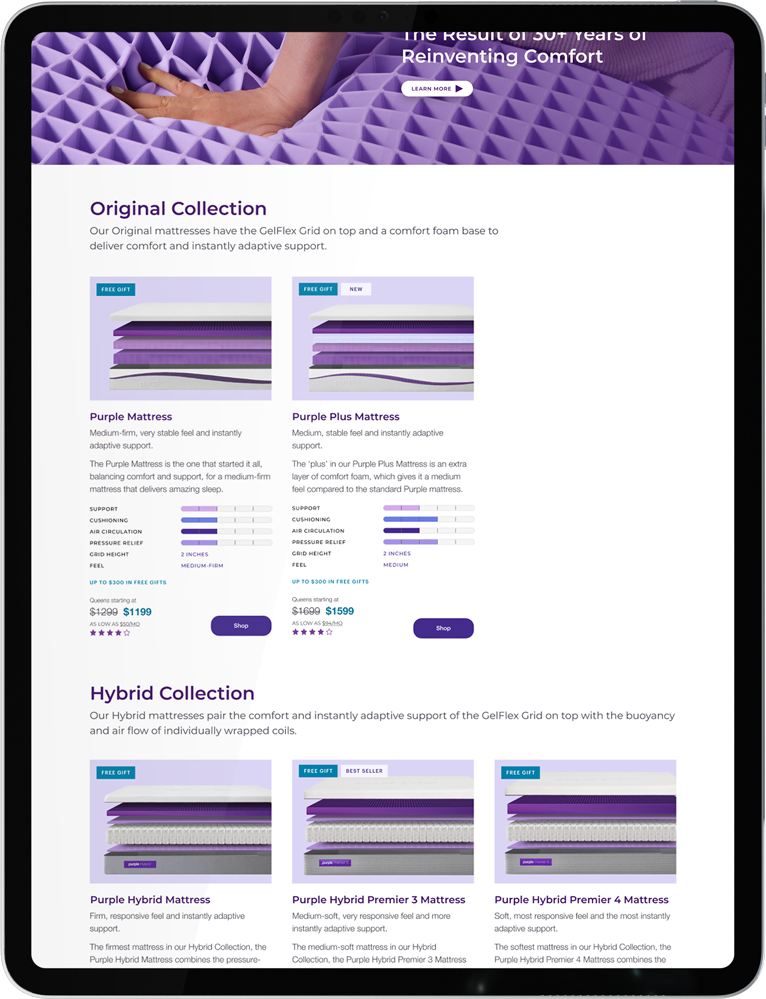
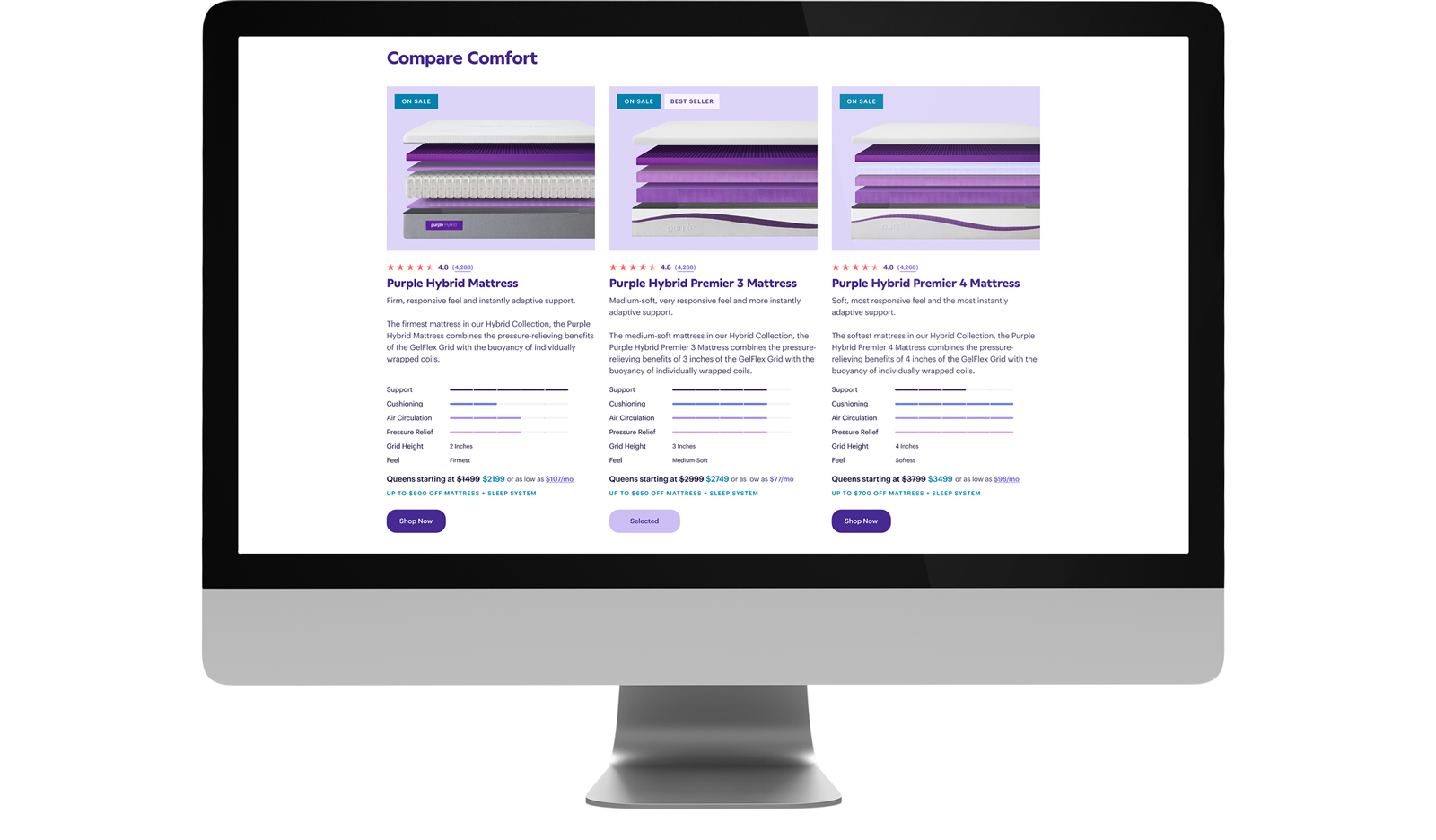
Mattress Assortment Breakout and Comparison
During my research, I discovered a significant pain point: our users thought we only offered three mattresses instead of five. I attributed the confusion to Purple's architecture which combined our beds into product families with upgrade options instead of individual commodities.
The challenge was to invent a new purchase decision flow that disunited the groupings across the site, diversifying our products without cannibalizing the sales of our high-margin models. I achieved this by revising the architecture, creating upsell components, updating assets, and designing infographics.
Phase 2 - Category
Phase 3 - Category
Phase 3 - Navigation
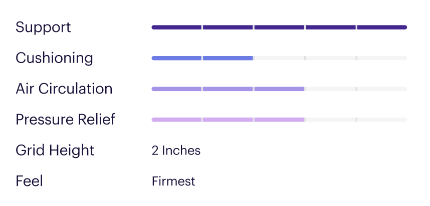
Measuring and Communicating Benefit
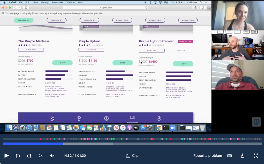
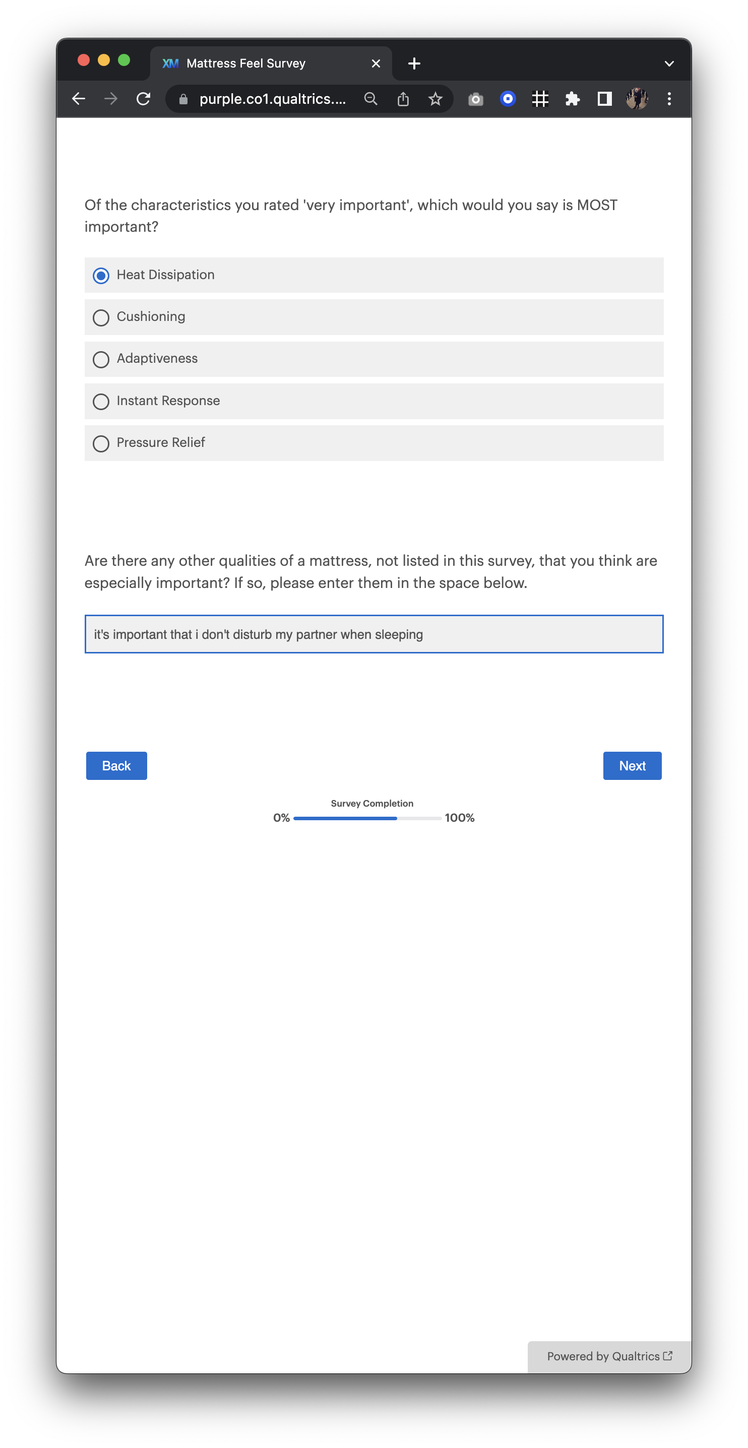
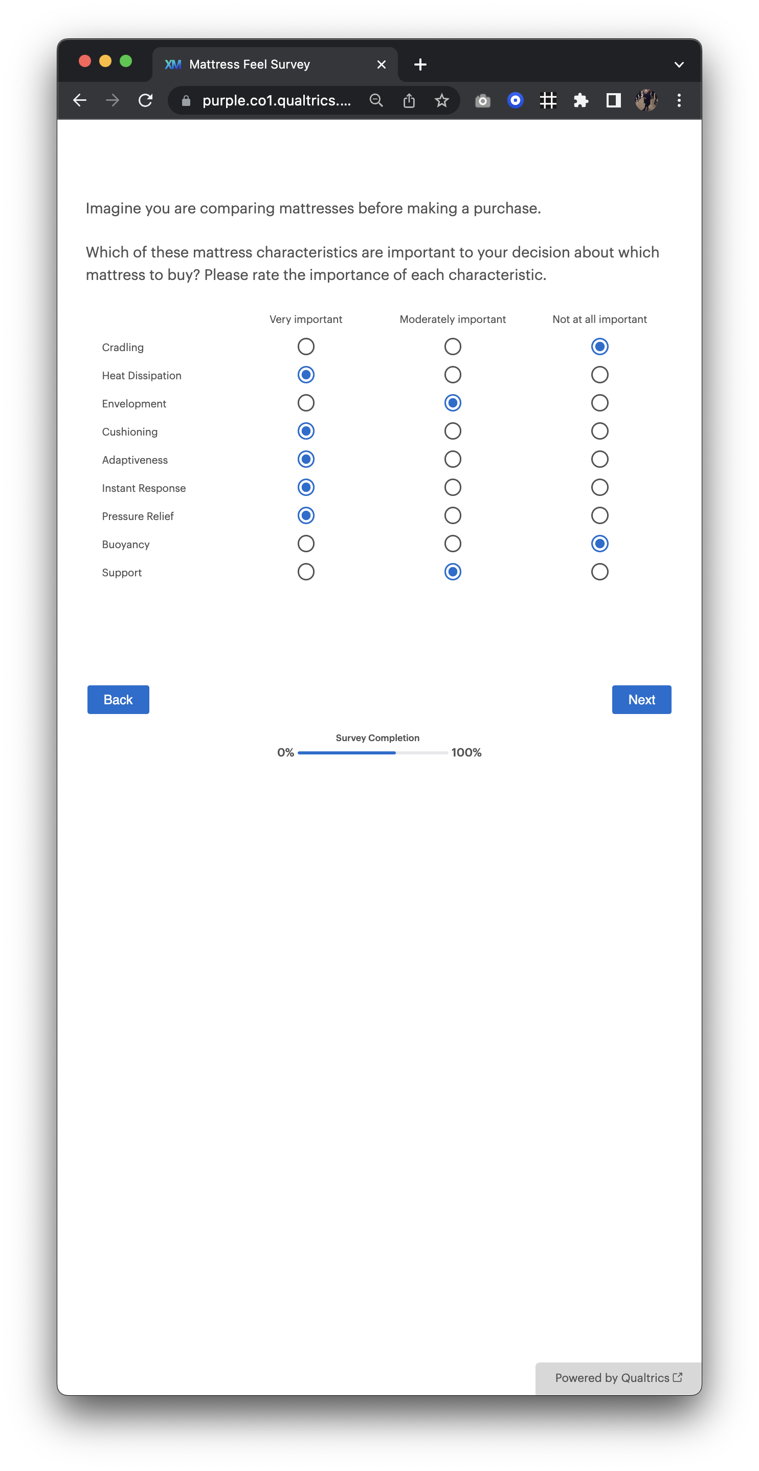
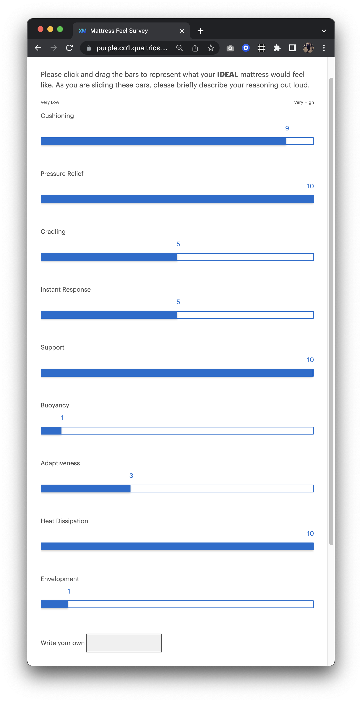
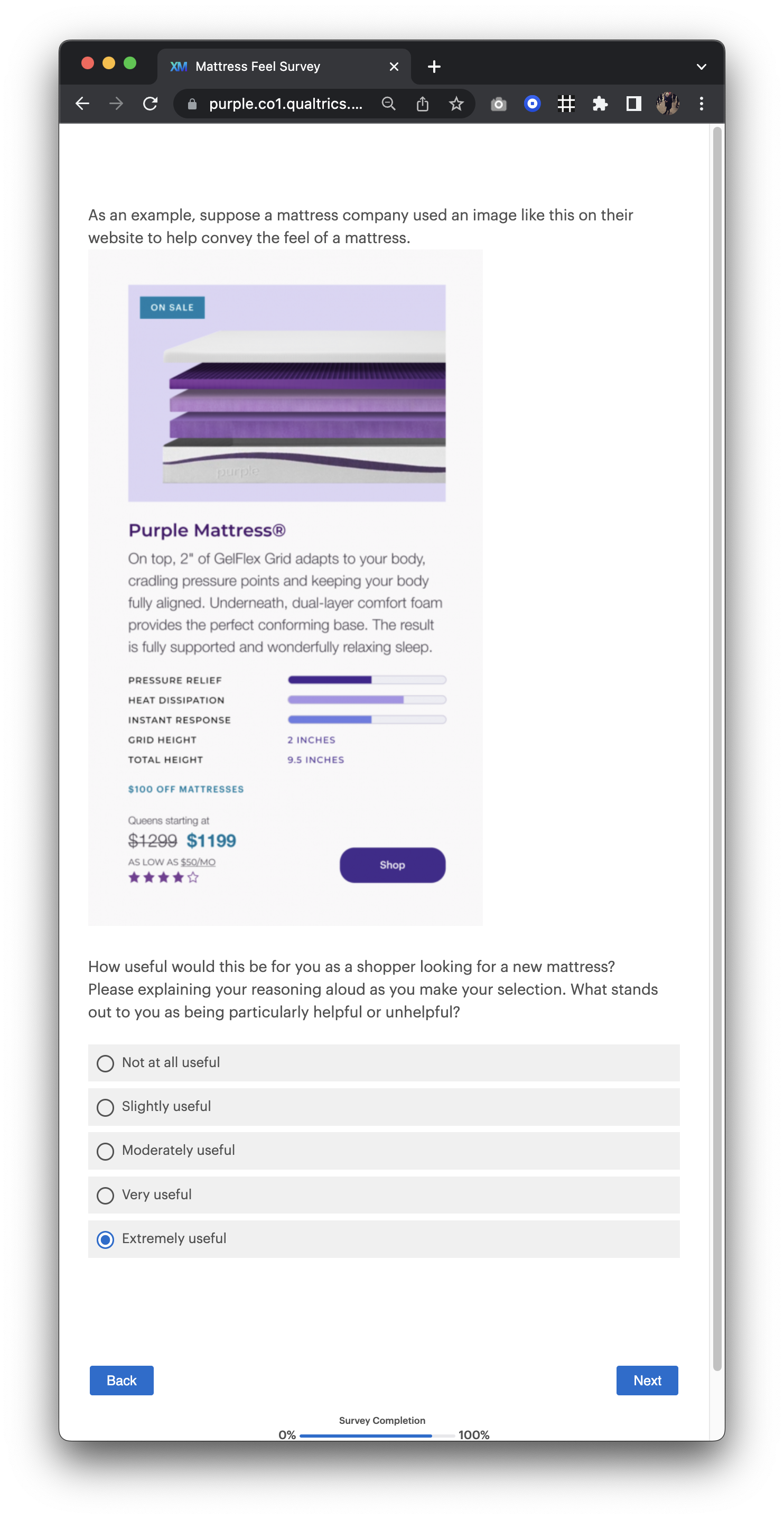
I moderated eight useability tests on our competitors' websites and quickly learned that a simple comparison chart or infographic helped users decide promptly and confidently which mattress they wanted to explore further.
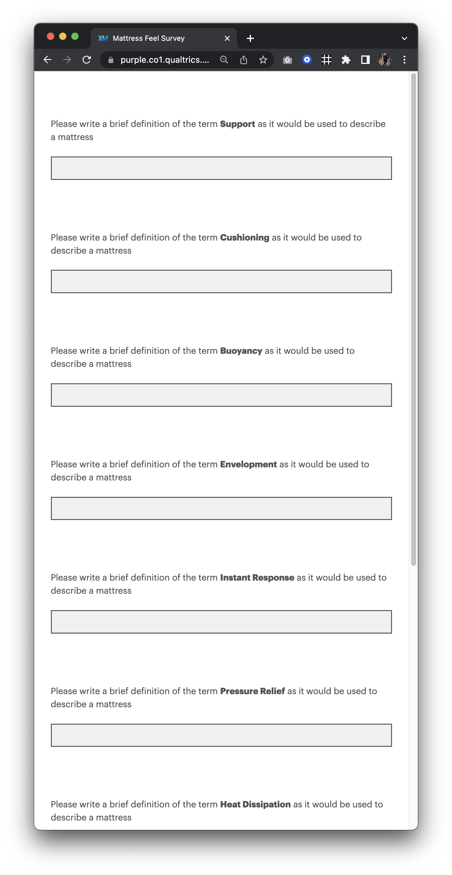
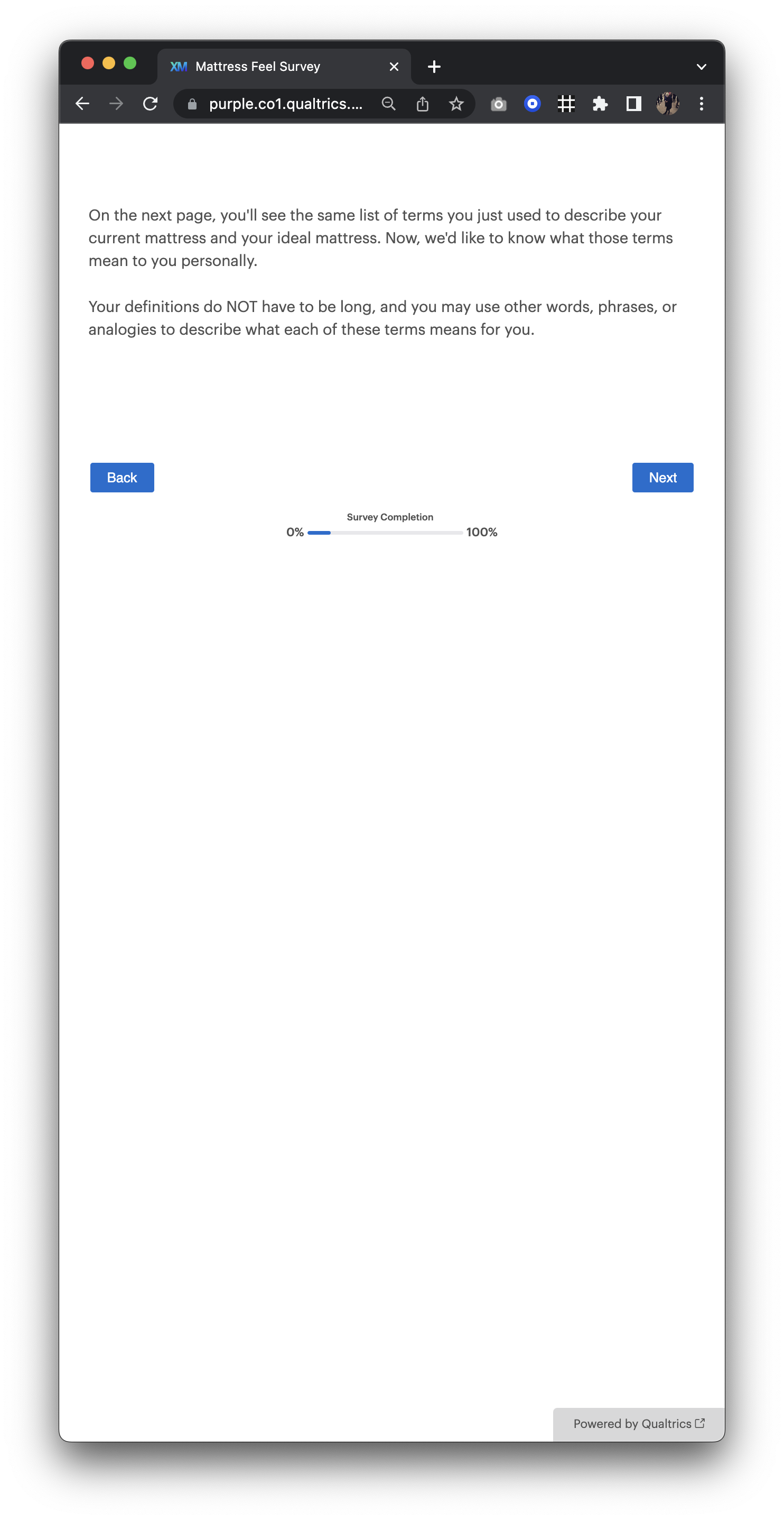
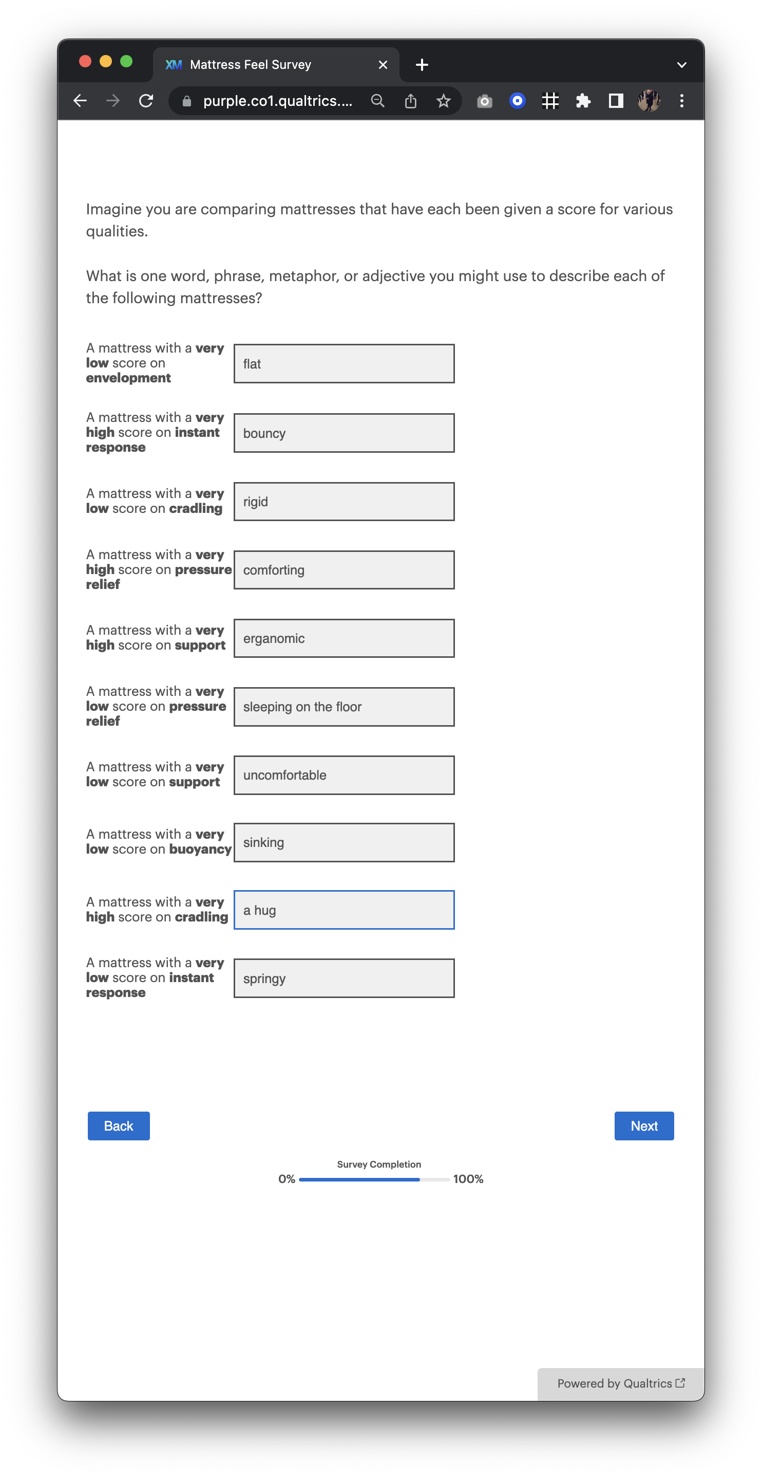
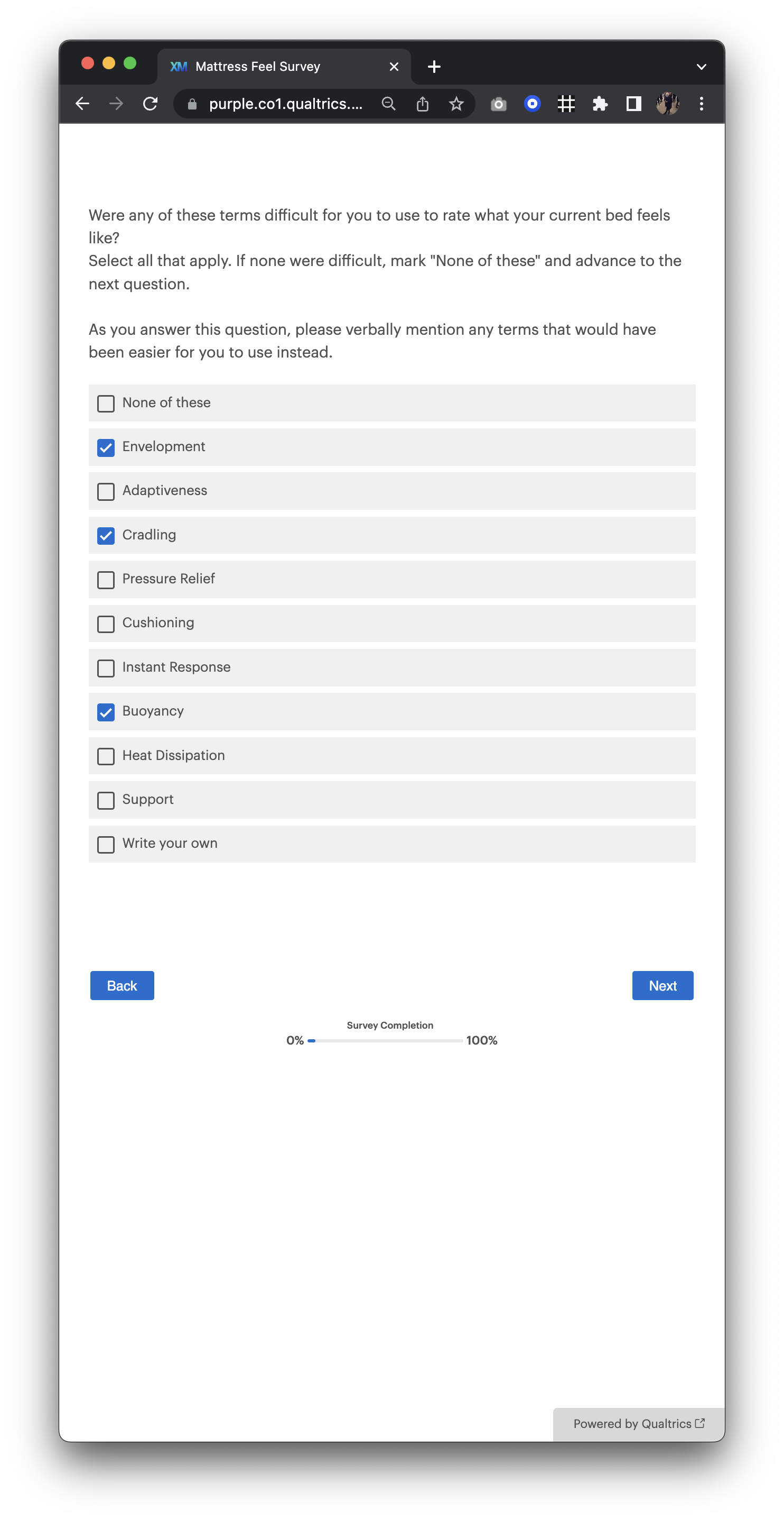
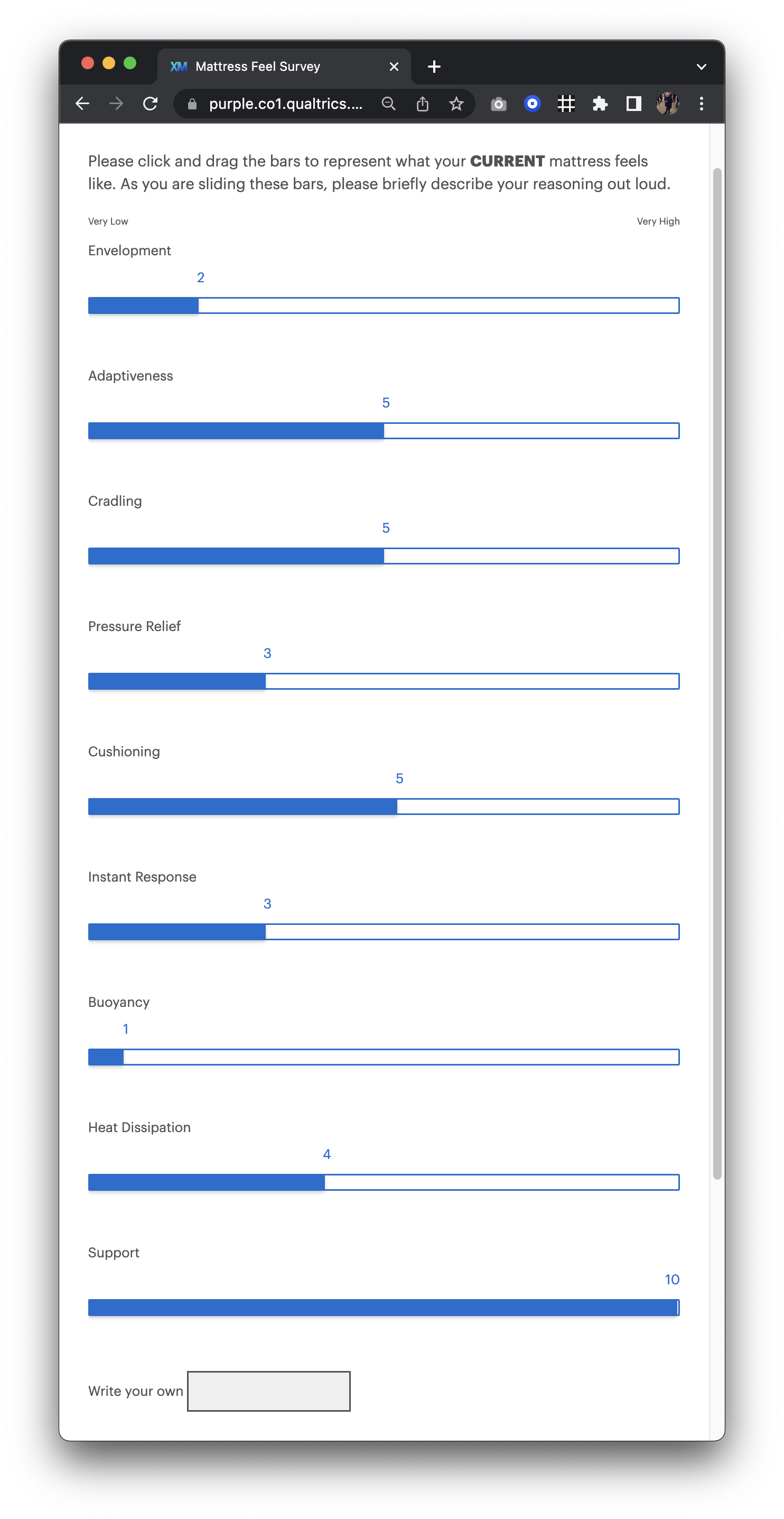
After some prototyping, we decided that a benefits bar chart would be the best visualization to help distinguish our products. The research team and I ran a Qualitrics "Mattress Feel" survey that helped us identify terms we should measure based on importance and clarity.
After introducing the bar chart on the category page, we reduced the speed of our clickthrough rate by 68% to the product page.
Product Page Upsells
I created upgrade paths on the product display pages to help prevent users from downgrading models to a lower price point. One touchpoint was added below the mattress size selector and gave a quick, bullet-point summary of the extra benefits the next model offered. Instead of showing the total cost of the mattress, we found through testing that displaying the difference in prices eliminated sticker shock and increased traffic to the upgraded model. We also included a "help me decide" link for an in-depth, side-by-side comparison.
I added the 2nd touchpoint mid-page, directly after an exploded view image of the mattress. The idea is that after a customer gains a better understanding of our interior components, we go on to show them how these layers stack up against across the assortment.
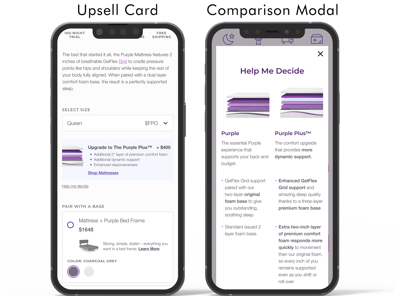
Product Display Page Upsells
Phase 4 - Reskin
Methods: High fidelity wireframes, unmoderated usability tests
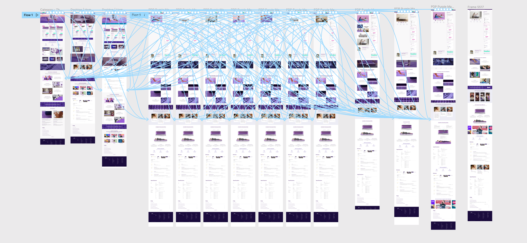
Redesign
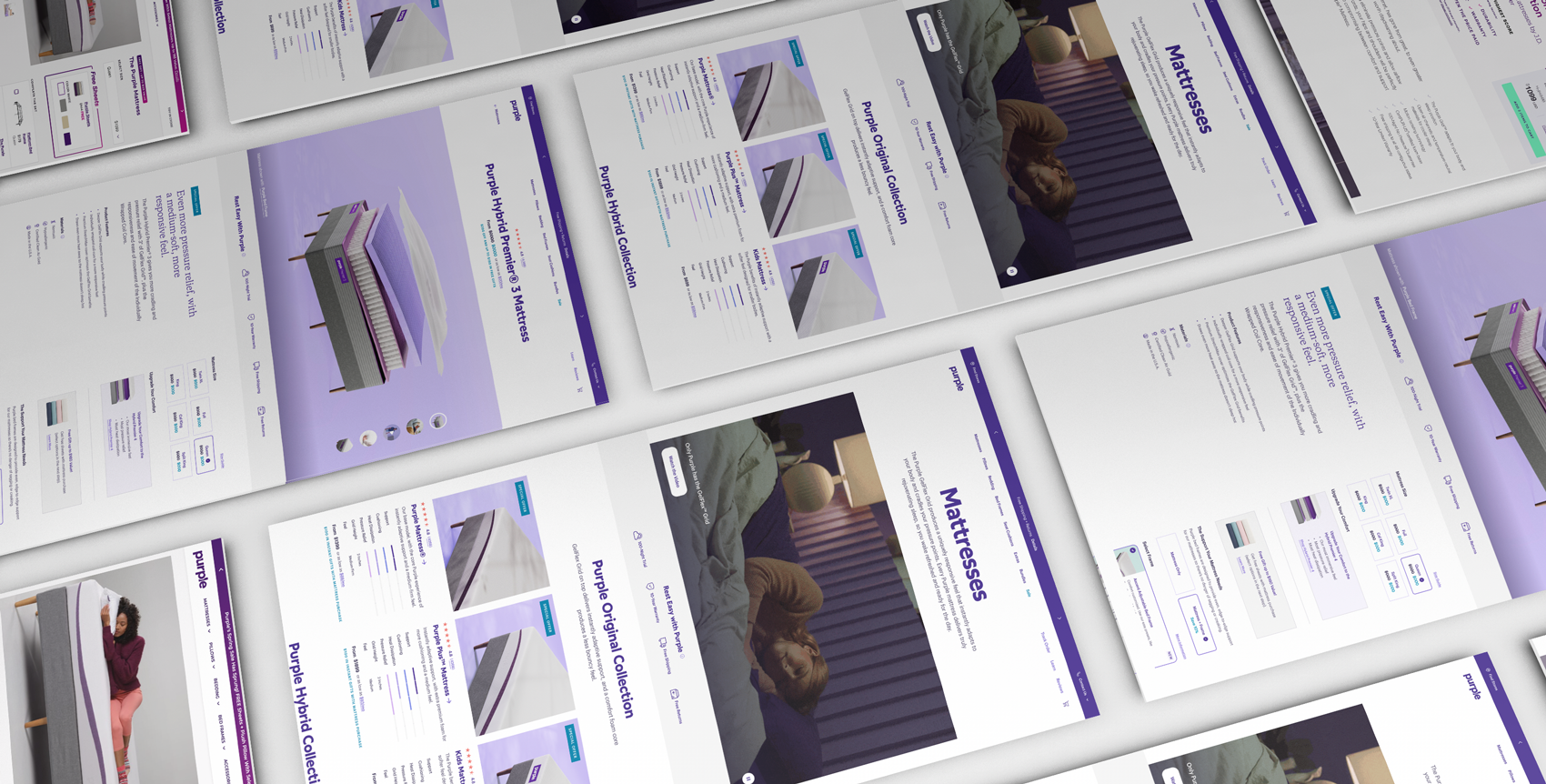
With the help of our talented Product Design team (Jeremy Garcia and Ashley Seguin), we implemented the new design system and gave our product path a major facelift. Below are cropped images of the final designs. Please click the link located at the bottom of the section to view the full experience in FIGMA.